
Below are examples of illustrations and summary statistics that can be produced using this data product. The examples are based on the November 2022 edition of the data product.
High Poverty Counties Over Time
This map illustrates the number of consecutive decades counties have had high poverty from 1960 to about 2019 (using 5-year estimates for 2015–19). In 1960, 78 percent—or 2,412 of all counties for which poverty status was determined, (3,110 counties out of a total of 3,142 counties)—had poverty rates of 20.0 percent or more. Among them, 680 (28 percent) continued to have high poverty through 1980. This change is largely attributable to the 1960’s War on Poverty initiatives, which resulted in widespread decline in county-level poverty rates. Between 1980 and 2019, poverty rates were relatively stable for most counties, mainly fluctuating with cyclical changes in the macroeconomy. As of the data period ending in 2019, there were 304 counties—13 percent of the counties with high poverty in 1960—that had consecutive decennial poverty rates of 20.0 percent or more. They are clustered in Appalachia, the Black Belt, the Mississippi Delta, the Ozarks, the Southwest, and in counties with large American Indian and Alaskan Native populations.
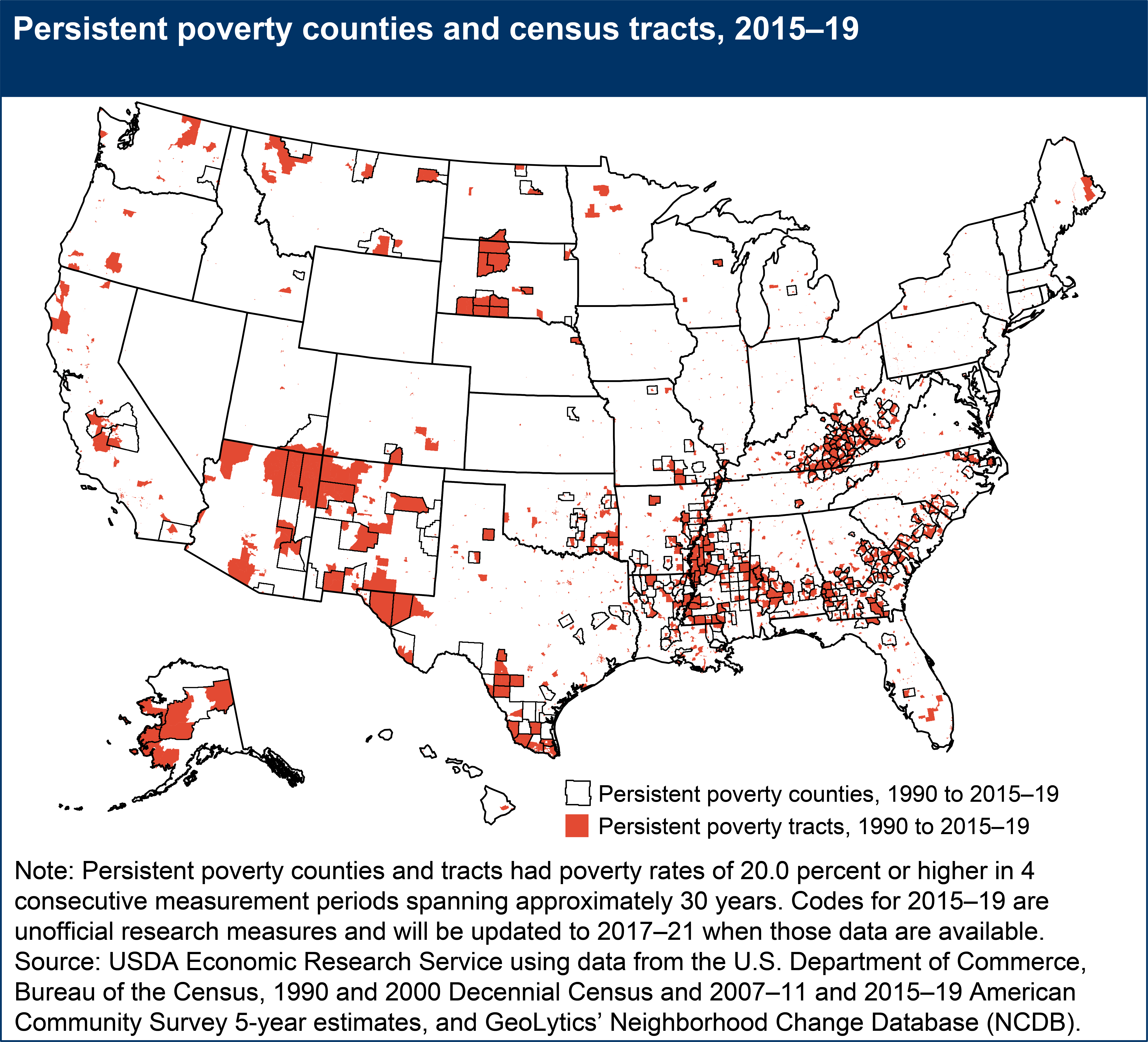
Comparison of Persistent Poverty Counties and Census Tracts
Persistent poverty areas have poverty rates of 20.0 percent or higher for 4 consecutive measurement periods spanning approximately 30 years. The 2015–19 research measure of county-level persistent poverty (unofficial update including decennial years 1990 and 2000 and ACS 5-year estimates for 2007–11 and 2015–19) identified 346 persistent poverty counties (11 percent of the 3,123 counties for which persistent poverty status was determined). In comparison, during the same time period, 12 percent of census tracts (8,299 census tracts out of 68,625 census tracts for which poverty status was determined) were identified as persistently poor. Among them, 75 percent (6,253 census tracts) were located outside of persistent poverty counties. They represent areas of concentrated poverty that were otherwise hidden at the county scale of analysis. With closer examination (e.g., zooming in on a particular county) this spatial comparison can also be useful for identifying whether persistent poverty is widespread within a county (where most census tracts are persistently poor) or whether the county’s persistent poverty area status is being driven by distinct within-county concentrations of the poor (where one or few census tracts are persistently poor).
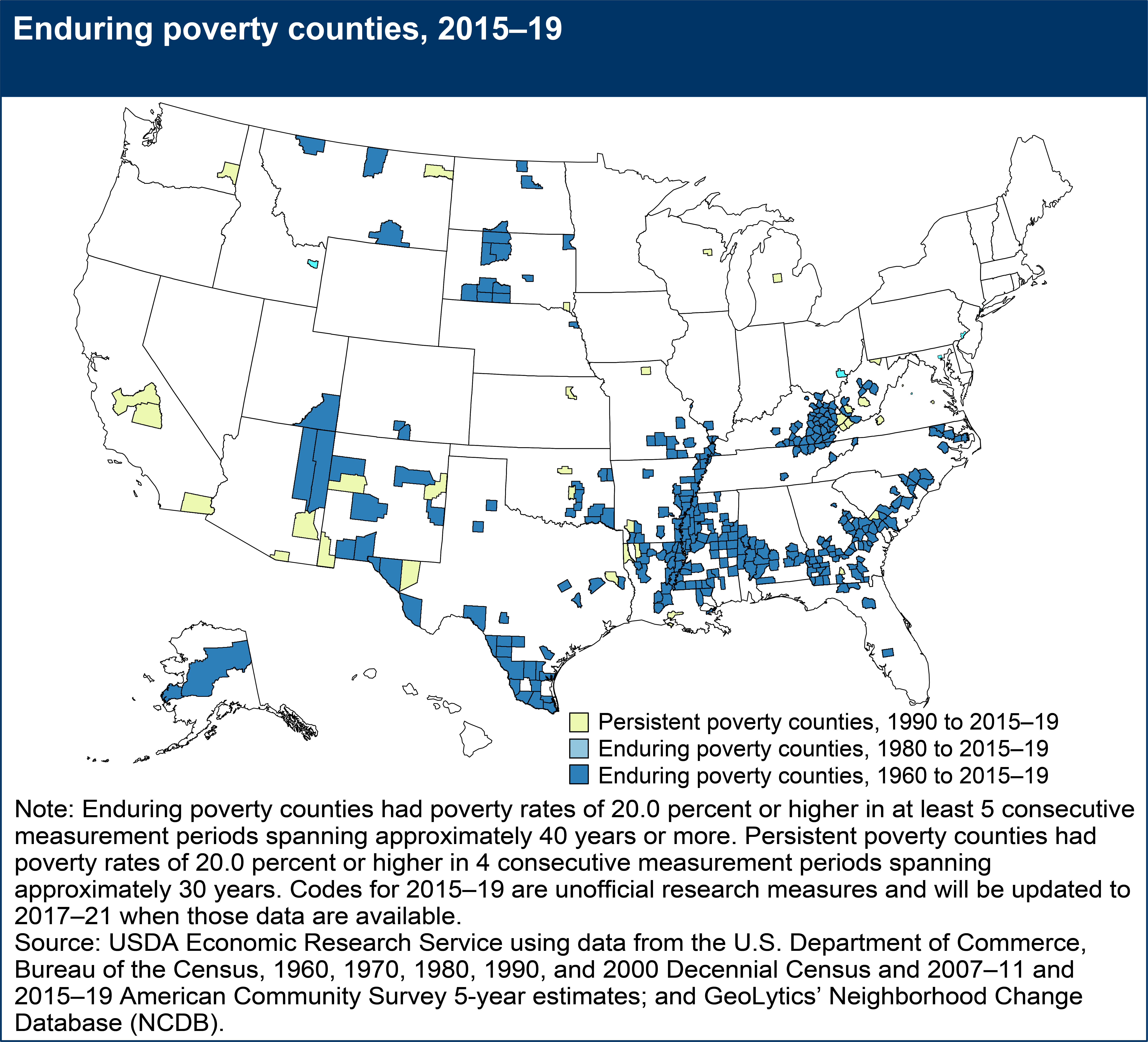
Comparison of Enduring and Persistent Poverty Counties
Enduring poverty areas have poverty rates of 20.0 percent or higher for at least 5 consecutive measurement periods spanning approximately 40 years or more. Of the 346 counties classified as persistent poverty for the 2015–19 research measure (unofficial update), 6 counties were classified as enduring poverty from 1980 to 2015–19 only, and another 304 counties were classified as enduring poverty from 1960 to 2015–19. This highlights that most counties with current persistent poverty status—based on the most recent 4 time periods spanning 30 years, have had consistently high poverty (according to point-in-time decennial data) since at least 1960. Additional comparisons of this county level information to the census tract poverty area measures available in this data product can be useful for determining if and where within-county concentrations of poverty have varied over time.
Comparison of High Poverty and Extreme Poverty Areas
High poverty areas have poverty rates of 20.0 percent or higher in a single measurement period. Extreme poverty areas are a subset of that group that have poverty rates of 40.0 percent or higher. Using 2015–19 5-year period estimates from the American Community Survey, 585 counties were identified as high poverty and of them 11 were identified as extreme poverty. In combination, they are outlined in the map below as high poverty counties.
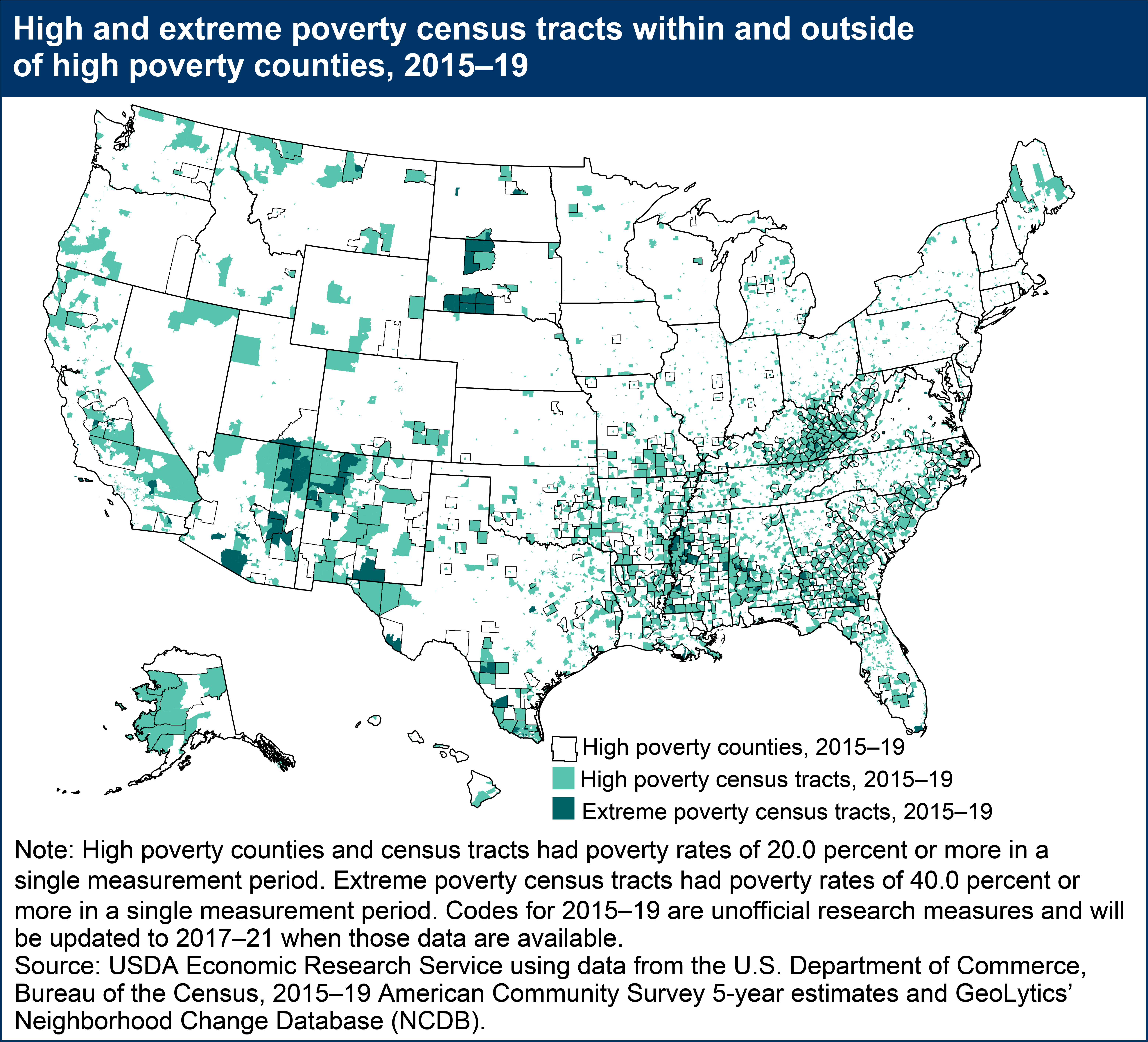
Of all census tracts for which high and extreme poverty status was determined (71,066 and 71,989 census tracts, respectively, out of a total of 73,057), 25 percent were identified as high poverty and 4 percent were identified as extreme poverty. Many extreme poverty census tracts are within high or extreme poverty counties, but the majority (67 percent) are outside of those county boundaries. Extreme poverty census tracts are found in the Midwest and Southwest in areas with high concentrations of Indigenous populations and in areas with Hispanic populations that have recently grown. They are embedded deep within historically poor areas of the broader South, including central Appalachia, along the Mississippi River Corridor of the Mississippi Delta region, and more dispersed across the Black Belt. High and extreme poverty census tracts also exist within areas that may not be a part of traditionally poor regions, often within urbanized areas that are less obvious on the map given that the land area of more densely populated tracts tends to be relatively small. (The land area of census tracts is related to population density. This can make it hard to identify many urbanized tracts in national scale census tract visualizations. Likewise, it can create the illusion of greater concentration of poverty in less population dense census tracts. Counties share a similar issue given variability in size, particularly when moving east to west.)
Regardless of their location, counties and census tracts identified as high or extreme poverty areas in 2015–19 may represent emergent, intermittent, or longstanding poverty areas. This cannot be determined by the current map, but examination of poverty area measures over multiple time periods can be useful for determining long-term trends as well as new patterns.