
Allocation of food-at-home expenditures across food categories does not vary much by income
- by Elizabeth Frazão
- 9/24/2015
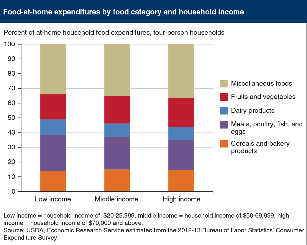
Most Americans have plenty of room to improve the nutritional quality of their diets and how they spend their food dollars. ERS researchers analyzed dietary recall data from the 2011-12 National Health and Nutrition Examination Survey and found that average dietary scores of consumers across different household incomes ranged from 48.1 to 54.5 on a scale from 0 to 100. (A score of 100 indicated full compliance with Federal dietary guidance.) How consumers allocate their grocery store food dollars among food categories reflect these scores. U.S. households across income levels had similar spending patterns for most food categories—allocating a much smaller share to fruits and vegetables (17 to 19 percent) than miscellaneous foods, such as soft drinks, frozen meals, salad dressings, and snacks (34 to 37 percent). This chart appears in “Following Dietary Guidance Need Not Cost More—But Many Americans Would Need to Re-Allocate Their Food Budgets” in ERS’s September 2015 Amber Waves magazine.